
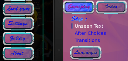
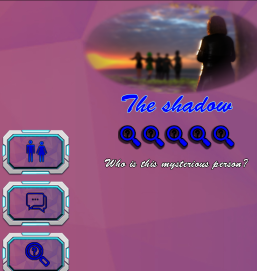
About Colors
First and foremost I’m enjoying the story just like it is. As long as you keep telling it I’ll probably stick around with or without modification. That said using more color contrast between text and the background around the text on the settings menus and on the in-game tablet would make it easier for me to read what’s there. For me this is more of a whishlist/nice-to-have item so no worries either way.
From the experiments I was able to run it looks like you are variations of something close to:
- Background: Violet (
#A914AE) over a textured image - Foreground (text): Blue (
#0000ff)
Screenshot of part of setting menu:
Screenshot of part of in game tablet screen:
Screenshot of what I was able to approximate myself (minus the texture):

The blue on violet are a bit too similar in brightness for me to see easily. When I plug them into a contrast calculator (https://webaim.org/resources/contrastchecker in this case) it shows a contrast ratio of 1.39:1 (I find 4.5:1 and better easiest).
Playing with the sliders a bit was using the same color family I found a couple of options that were easier for me to read:
- Same blue (
#0000FF) on a much lighter violet (#F1A4F4)
- Slightly darker blue (
#00007A) and slightly lighter violet (#E243EA) than currently in game
Those average out at a bit over 4.5:1 contrast ratio and I can see both a bit better. If you spend some time playing wit the sliders on that site it should help come up with a combination that works for you while having better contrast.